|
This quarter we focused on work in Adobe Illustrator and the tools within it. The first tool we took time to learn was the pen tool. This tool had a bit of a learning curve to it because it was a little weird to use and not always very clear how it worked. Illustrator was a interesting program to learn because it worked similarly to Photoshop but still had many differences that took some time to get use to. I've personally really enjoyed learning this and developing my skills as much as possible.
0 Comments
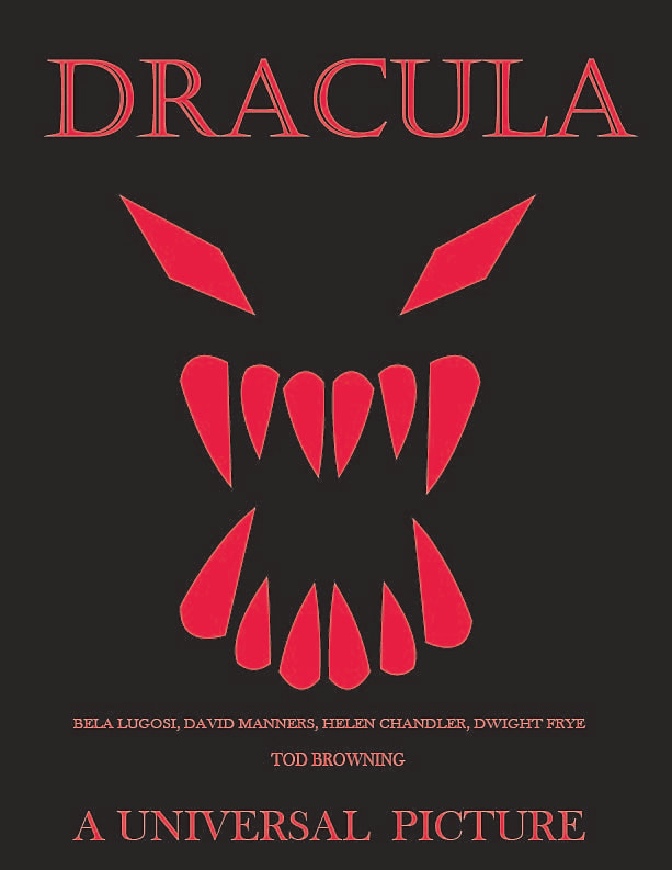 I made a poster for the original Bela Lugosi "Dracula". I chose a bright red because it really pops off of the all black background as well as the obvious blood relations that are prevalent in "Dracula" and vampire media generally. I used a different font for the title from the rest of the test to make the title even more distinct from the rest of the text as well as give it a gothic feel that connects it to the gothic vibe of the movie generally. I also made the "Universal Picture" text much larger than the rest of the more informational text at the bottom because I feel that Universal's importance to this movie and Dracula as a whole should be respected in some way since this movie and the most popular monster movie's of the time are known as the "Universal Monster Movies".
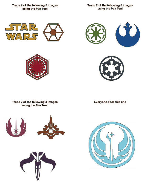 This was a fun activity that helped further my familiarity with the pen tool. This helped me not only work with the pen tool but also how to use the pen tool in relation with other pen tool creations and ensuring the colors were separated properly and worked together well.
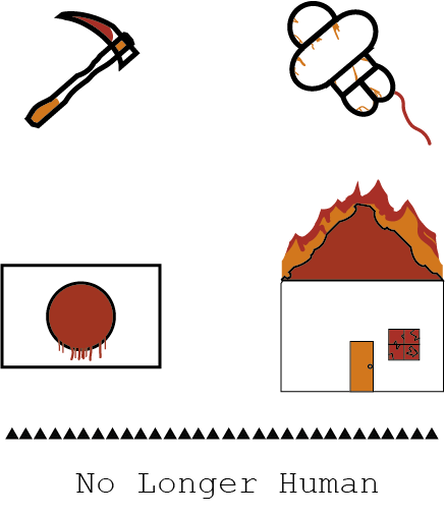 This has helped me get much more familiar with with the tools in Illustrate. This project has also let me apply some of what I've learnt from color theory and design.
|
Disclaimer StatementThe views and opinions expressed in this blog are solely those of the author and do not represent those of Chapel Hill HS or Chapel Hill-Carrboro City Schools. Archives
May 2024
Categories |
 RSS Feed
