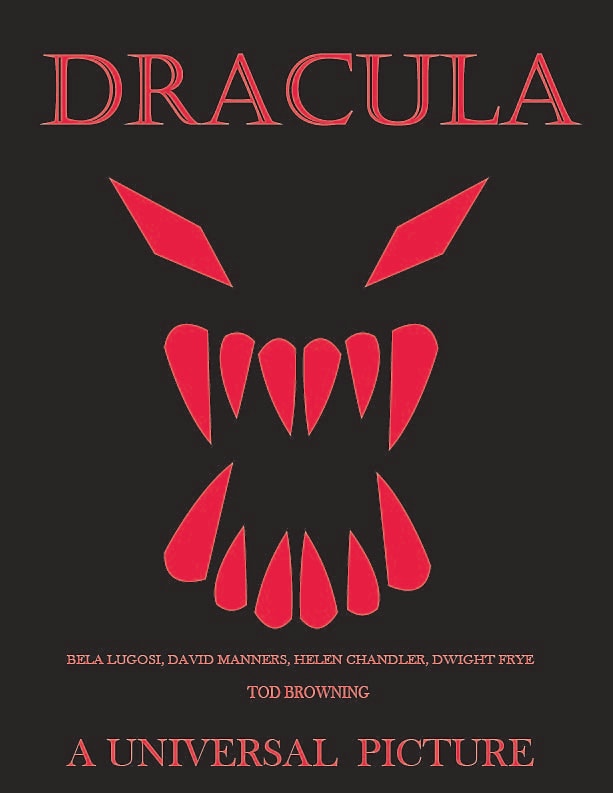
 I made a poster for the original Bela Lugosi "Dracula". I chose a bright red because it really pops off of the all black background as well as the obvious blood relations that are prevalent in "Dracula" and vampire media generally. I used a different font for the title from the rest of the test to make the title even more distinct from the rest of the text as well as give it a gothic feel that connects it to the gothic vibe of the movie generally. I also made the "Universal Picture" text much larger than the rest of the more informational text at the bottom because I feel that Universal's importance to this movie and Dracula as a whole should be respected in some way since this movie and the most popular monster movie's of the time are known as the "Universal Monster Movies".
0 Comments
Leave a Reply. |
Disclaimer StatementThe views and opinions expressed in this blog are solely those of the author and do not represent those of Chapel Hill HS or Chapel Hill-Carrboro City Schools. Archives
May 2024
Categories |
 RSS Feed
